John Gibson Displays identity redesign
Identity design
John Gibson Displays liked their current, iconic graphic identity but required an update due to alterations in the company structure.
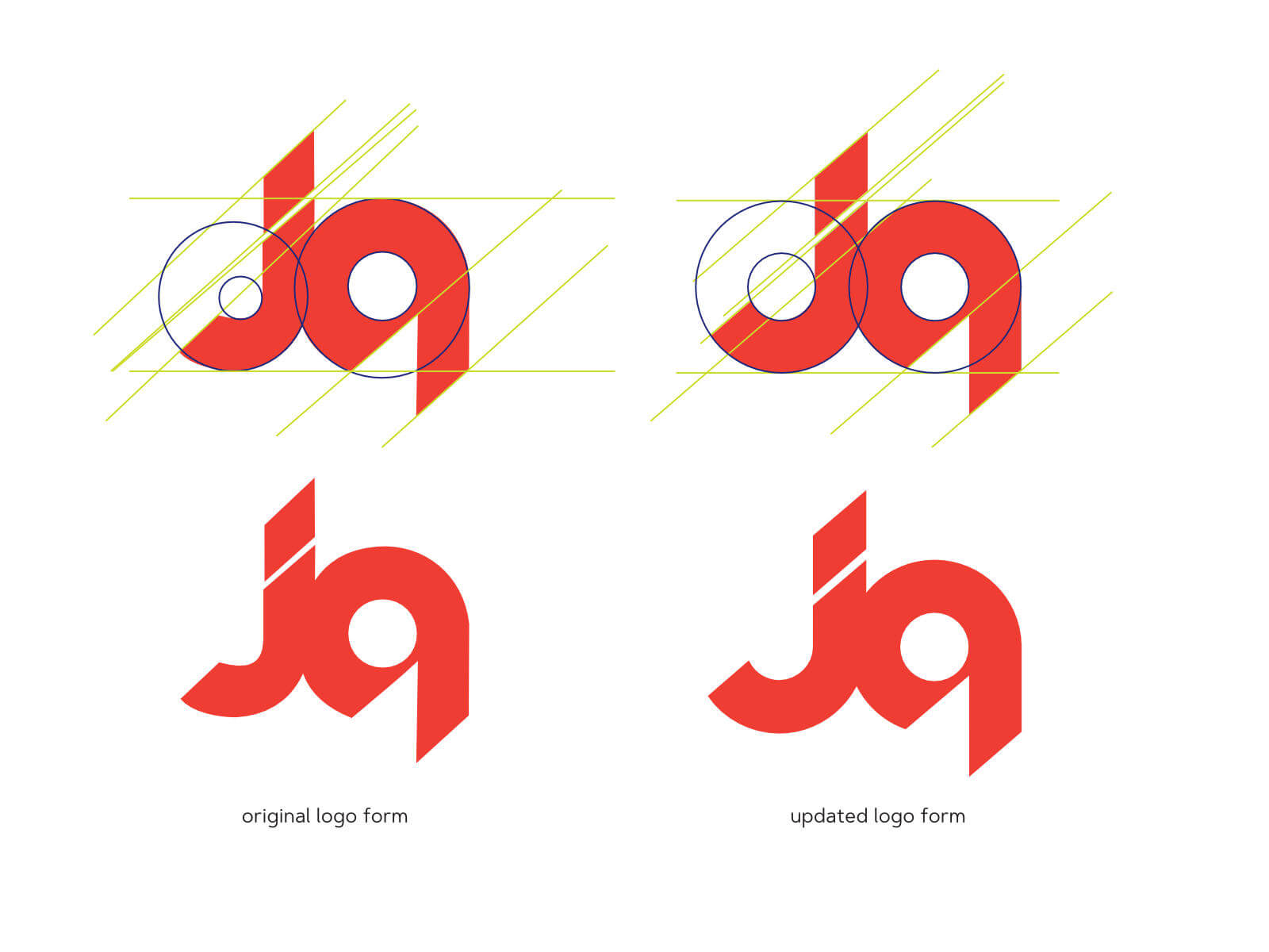
The icon form had never been altered for digital usage since its initial creation – by hand – in the 1960s and needed to be updated before other elements could be added for their new ‘expo solutions’ and ‘exhibition systems’ departments.
The update needed to maintain the feel of the original form but bring alignment to the forms that, although balanced to the eye, had basic forms with varied angles, shapes and sizes. The addition of the letter ‘d’ to the icon form, and the creation of two variations that were related but visually individual, rounded out the new identity.

Identity design


